In today’s fast paced world, people rely on their mobile phones for nearly everything from catching up with friends to making online purchases. For small businesses, this shift in consumer behavior is an opportunity. If you’re using Shopify to run your online store, mobile first design isn’t just a nice to have; it’s a must.
In this article, we’ll explore what mobile first design is, why it matters for small brands using Shopify, and how you can create a better shopping experience for your customers using this approach.
What Is Mobile First Design?
Mobile first web design means designing your website starting with mobile devices in mind before scaling up to tablets and desktops. Instead of creating a full desktop version and then shrinking it to fit smaller screens, you do the opposite design for small screens first, then expand.
With more than 70% of e-commerce traffic coming from mobile devices, this design philosophy ensures your store loads fast, looks clean, and functions smoothly on smartphones where your customers are most active.
Why Small Businesses Need Mobile First Shopify Stores
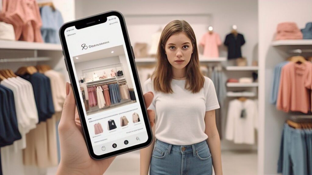
Boosting Shopify Store Performance on Mobile
Small brands often face tough competition from big players. A mobile first Shopify design levels the playing field by making your store more accessible and user-friendly. Shoppers are impatient if your website doesn’t load quickly or if the layout is confusing on a phone, they’ll leave within seconds.
A mobile first design ensures:
- Faster loading speeds
- Cleaner navigation
- Easy-to-tap buttons
- Less clutter
- Better customer experience
All of these help reduce bounce rates and increase sales especially for first-time visitors who land on your site from social media ads or Google search.
Mobile Optimization Improves SEO Rankings
Shopify SEO and Mobile Responsiveness
Google uses mobile first indexing, which means it looks at the mobile version of your site when deciding where to rank you in search results. If your Shopify store isn’t optimized for mobile, your SEO will suffer, no matter how good your content is.
Mobile first design helps small brands:
- Improve page speed (a Google ranking factor)
- Enhance user engagement metrics (like time on site)
- Increase visibility on mobile search
When your store is easier to navigate and loads faster, users stay longer and Google sees that as a sign of quality.
Better Conversion Rates on Mobile Devices
Driving Sales with Mobile Friendly Shopify Design
The goal of any eCommerce store is to convert visitors into buyers. Mobile first design plays a big role here. It makes it easier for users to complete tasks like adding items to their cart or checking out without zooming in or getting frustrated by slow buttons.
According to Shopify data, stores with mobile-optimized designs see higher conversion rates than those that aren’t. For small brands, every sale counts. A small improvement in mobile usability can lead to a big increase in revenue over time.
User Experience Is the New Competitive Advantage
Shopify UX Best Practices for Small Brands
User experience (UX) isn’t just about visuals it’s about how easy and pleasant it is to use your site. Small businesses often don’t have large marketing budgets, so your Shopify store’s usability becomes your best tool for attracting and retaining customers.
Here are a few UX best practices for mobile first Shopify design:
- Keep menus short and simple
- Use clear product photos that load fast
- Make the “Buy Now” or “Add to Cart” button prominent
- Use large fonts for easy reading
- Allow guest checkout for convenience
These small tweaks help reduce friction in the buying process and build trust which is essential for small brands trying to grow.
Mobile First Design Supports Social Commerce
Integrating Social Media and Shopify for Mobile Users
Many small brands rely on platforms like Instagram, Facebook, or TikTok to bring traffic to their Shopify store. Since most users access these platforms on their phones, it makes sense that they’ll visit your store using a mobile browser.
If your site isn’t optimized for mobile, they’ll bounce and you’ve just wasted ad spend or lost a potential customer. A mobile first Shopify design helps you make the most of your social media efforts by providing a smooth, responsive landing experience for new visitors.
Building Trust with a Polished Mobile Experience
How Design Impacts Brand Trust on Shopify
First impressions matter, especially for small businesses that are still building their brand. A clean, fast, and easy-to-navigate mobile site sends the message that your brand is professional, trustworthy, and cares about the customer experience.
Mobile first design isn’t just about making your site pretty. It’s about creating a reliable experience that makes people feel confident about buying from you even if it’s their first time hearing about your brand.
Tips for Designing a Mobile First Shopify Store – Practical Strategies
You don’t need to be a developer to get started with mobile first design on Shopify. Here are some simple steps:
- Use a mobile-responsive Shopify theme – Choose one that automatically adjusts for different screen sizes.
- Prioritize speed – Compress images, limit apps, and avoid unnecessary animations.
- Test on real devices – Don’t just rely on desktop previews. Check how your site looks and works on different phones.
- Focus on the essentials – Only show the most important information and features on mobile screens.
- Simplify the checkout process – Fewer steps and fields lead to more completed purchases.
Long Term Benefits of Mobile First for Shopify Stores
As mobile usage continues to grow, designing for mobile is no longer optional it’s the standard. For small brands, this approach not only improves current performance but also sets you up for long-term success.
You’ll be better equipped to:
- Scale your business with confidence
- Improve customer satisfaction
- Stay competitive with larger brands
- Adapt to future tech changes (like voice search or AI tools)
Investing in mobile first design is one of the smartest decisions you can make for your Shopify store today.
Final Thoughts
For small brands on Shopify, mobile first design isn’t just a trend it’s a necessity. With more customers browsing and buying on their phones, a mobile-friendly store helps you stand out, convert more visitors, and build lasting trust.
By focusing on speed, simplicity, and usability, even small businesses can deliver a big-brand experience all from the palm of a hand.
Want help building a mobile first Shopify store that converts? Start by choosing a mobile responsive theme, optimize for speed, and always think about how your customers interact with your store on their phones. Hire shopify expert